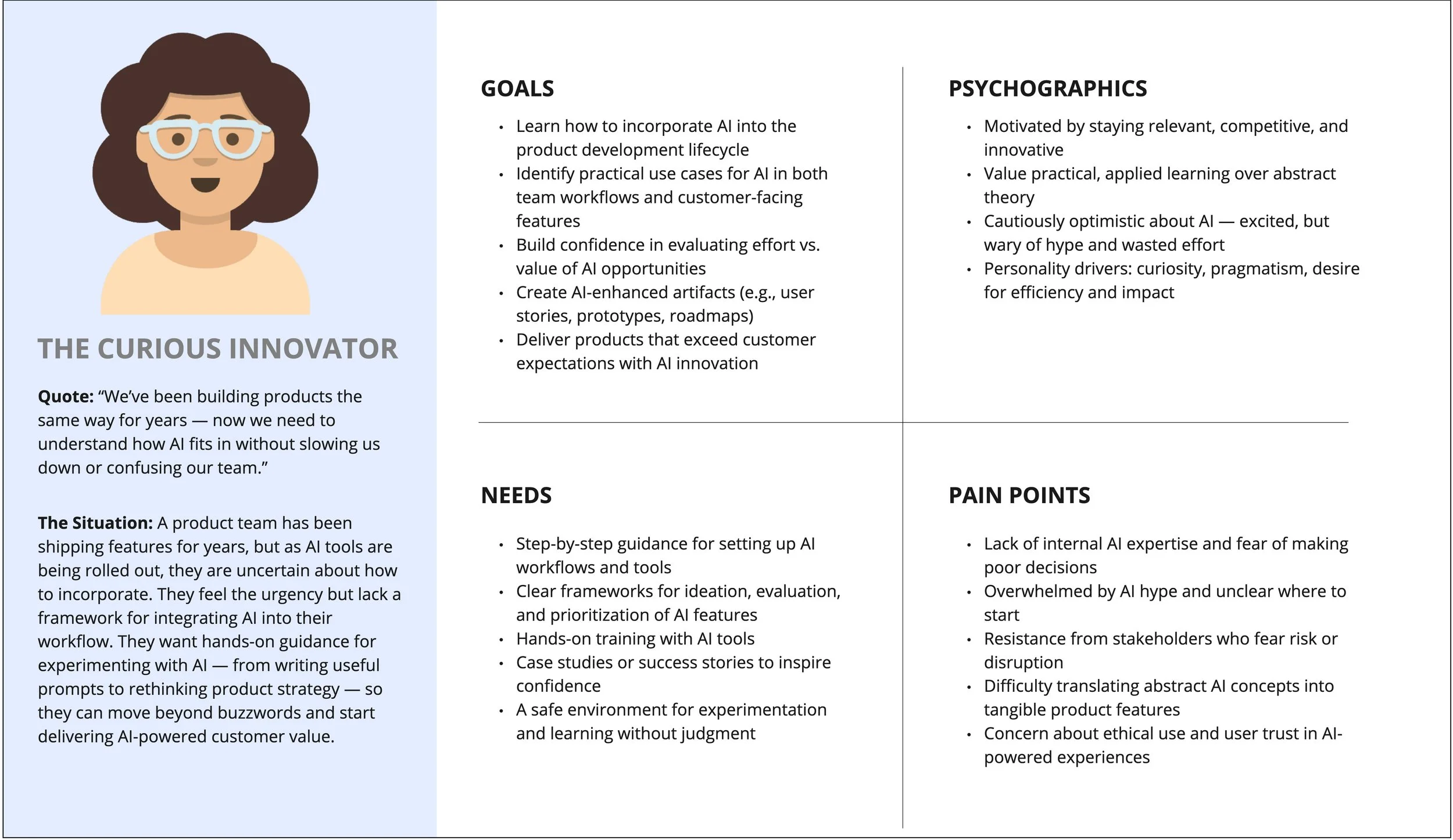
Why Teams Struggle with AI (And How I Fix It)
Many product teams are eager to explore AI, but the flood of hype and tools can feel overwhelming. Without clear frameworks, it's hard to know which opportunities are worth the effort, how to avoid wasted time, or how to reassure stakeholders who worry about risk.
That's why I focus on making AI practical, approachable, and relevant to your work. From step-by-step guidance and hands-on training to safe spaces for experimentation, I help your team move past buzzwords and start building real confidence. Together, we'll turn uncertainty into momentum—and curiosity into products that deliver meaningful AI-powered value.
Outcomes you can expect
-
Speed to Market
Reduce prototype-to-validation cycles by 60-80%
Ship roadmap items faster with working demos that secure stakeholder buy-in
Turn weeks of exploration into hours of validated learning
-
Measurable Productivity Gains
Teams accomplish more without working longer hours
Clear playbooks eliminate wasted time on tool experimentation
Cross-functional alignment reduces handoff delays
-
Competitive Advantage
Your team stays ahead of AI adoption curves, not chasing them
Build institutional knowledge that compounds over time
Attract and retain talent who want to work with cutting-edge tools
-
Risk Mitigation
Ethical guardrails prevent costly mistakes
Structured experimentation replaces risky ad-hoc AI usage
Leadership maintains visibility into AI initiatives across teams
Services
-
AI Capability Building: From Training to Measurable Performance Gains
Give your team the confidence to use AI every day. I design hands-on workshops and create simple playbooks so your designers, PMs, and researchers know exactly which tools to use, when, and how.
-
Rapid Prototyping with AI Tools
Turn ideas into testable prototypes in hours, not weeks. I guide teams in using tools like Figma Make or Lovable to quickly explore, refine, and validate concepts — and even pitch roadmap items to leadership with working demos.
-
Cross-Functional Collaboration Programs
Help your product, design, and engineering teams learn how to use AI together. I facilitate collaboration sessions that break silos, align workflows, and make AI part of how teams co-create solutions.
-
AI Center of Excellence Setup
I help you establish a company-wide AI hub that brings together people across disciplines to share insights, training, and ethical best practices. Instead of a burden, it becomes a shared resource that fuels momentum across your organization.
